If you’ve logged on to your MindMeister and MeisterTask accounts lately, you’ve probably noticed lots of updates from Meister HQ. We’ve made a few changes. Do not panic. It was all intentional. Meister has debuted a new name and logo and so have our tools. Here’s the inside scoop behind our updated look.
“The only thing that is constant is change.” – Heraclitus
From MeisterLabs to Meister
Our story began back in 2006. We created an online mind mapping tool that was the first of its kind in the sense that it was (still is) cloud-based and allowed for easy team collaboration. The only thing this product needed was a name. A name that alluded to the product and what it does, a name that proudly showcased our Germanness but could still be easily understood, and a name that had broad appeal and could resonate with an international audience. So, MindMeister it was (if you are wondering whether we tried MeisterMind out first – we did.)
The fact that Meister sounds a lot like the English word master is no accident. We felt that MindMeister aptly represented what we are about and what we wanted people to achieve using our product — mastery. 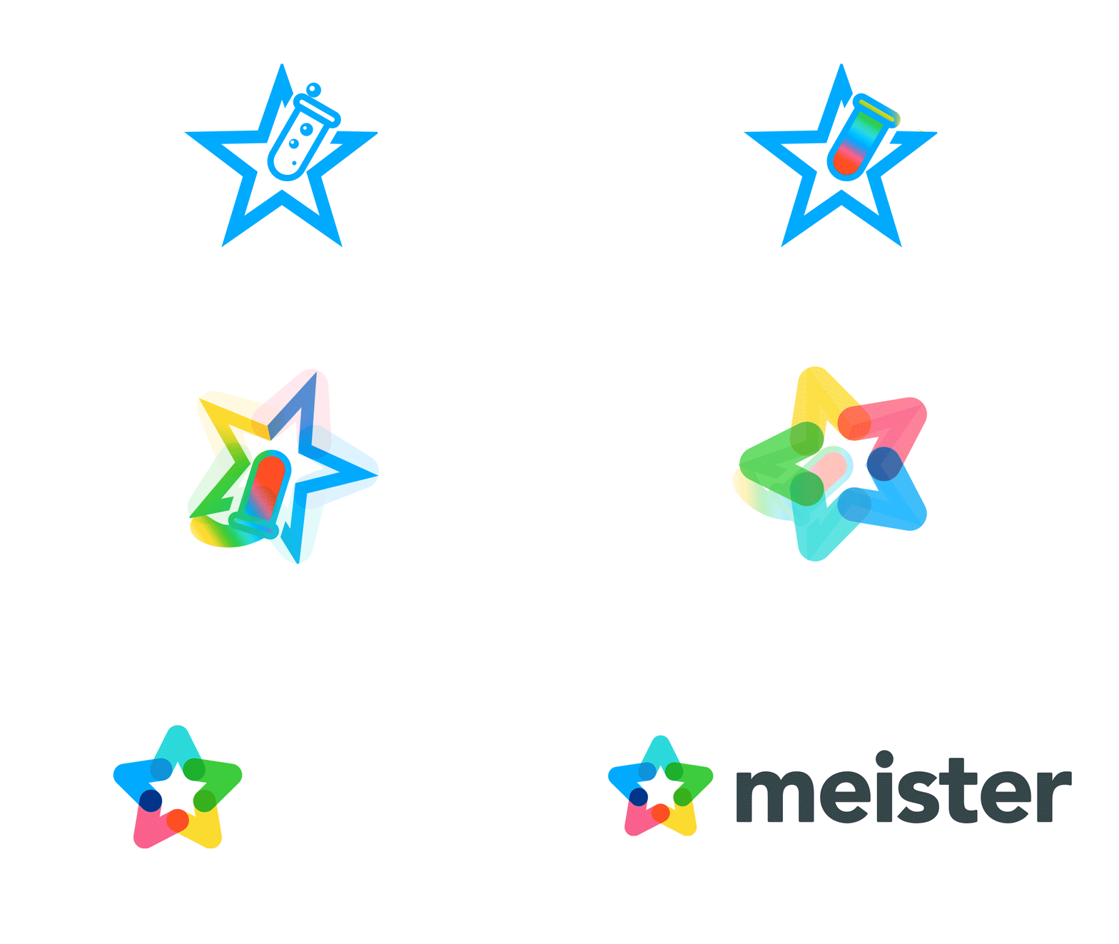
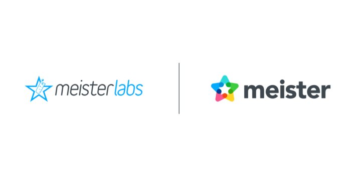
The name MeisterLabs followed naturally as a company name for us. What were we doing? Creating new products. We fancied ourselves being a bit experimental, dabbling in new technologies within the SaaS industry. We kept the Meister as the overarching brand name and added labs to describe this. Thus MeisterLabs GmbH was founded in 2006.
The Quest for Simplicity
Over the years, we came to realize that many of our clients, users and business partners knew us as Meister, just Meister. MeisterLabs created a lot of confusion. We decided to drop the labs and make it official. It was an easy decision for us in the end because it fitted our strategy perfectly. We aim for the ‘Meister’ brand to be synonymous with an understated, user-centric design that’s extraordinary and comfortable within its own simplicity. Rebranding and changing our name was just one part of our self-defining process.
It’s important to take stock of our journey every now and then. Take the time to contemplate, think about what we’ve achieved, who we were, what we’ve learned and of course where we want to be and what we want to achieve in the future. We’ve changed, we’ve grown, we are a different company now. MeisterLabs served us well for a time but no longer reflects who we are. Change is good. Evolution is good. Meister is a reflection of our growth as a company.
To Meister And Beyond…
Our goal from the get-go was to evolve into a multi-product company that offers intuitive and easy-to-use products that assist people in mastering their working and private lives. With Meister being the official company name and the brand that all tools in the Meister Suite would fall under, our focus could turn to our products. The update to our name, logo and icon serve to future-proof ourselves.
We decided to give our star icon a reboot. Ditched the beaker and gave every point of the star a fresh coat of paint. As you can see, MindMeister pink and MeisterTask blue are both represented as separate points on the star — also, no accident.
Hint: There is another something in the pipeline…. sshh!
You’ll also notice that the points overlap slightly. These overlaps represent the symbiosis between our products. Just like MindMeister and MeisterTask, all Meister tools will hold their own as independent, standalone products, but also feature seamless integrations with the other tools.
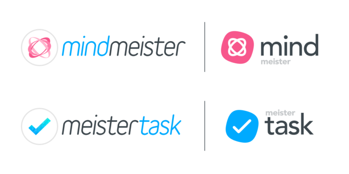
Now let’s take a look at the new product logos. The previous MindMeister and MeisterTask logos were quite similar save for the colors. The logo refresh adds a zap of color that will hopefully help people tell the tools apart and increase the differentiation but also expertly showcase each tool’s uniqueness. This is further demonstrated in bringing mind and task to the forefront. It also adds a versatile shape to the icons — square with rounded edges — a design that will look good on any device and in any app store.
Why Now?
When companies rebrand, it’s usually not something that most users pick up on. There’s usually an update that’s required, some text written in the “What’s New” section of the app store notification and it’s mostly glossed over. After the update, a new icon appears on the device and that’s that. It’s a largely superficial change. Of course design and look matter to users, but not as much as a product’s performance and reliability — that always takes precedence. So why now?
The answer is simple. We’ve recently launched MeisterTask 2.0 and have successfully migrated all users across (patting ourselves on the back). Now, we are working on a massive MindMeister rewrite that will change the online mind mapping game.
We’ve basically created (and are busy creating) completely new products. Our new products coincide with our rebrand.
Meister has been reinvigorated. We can now say with confidence that we are sure of where we are going and where we want to be as a company. We have a clear path ahead of us and are making our way to becoming a globally recognized brand. The feedback and response have been great so far. Here’s to the future and Meister making its mark by literally putting our star up there in the sky. Hear, hear!
